Showing posts with label chair. Show all posts

Tuesday, 25 April 2017

Muted Colors

Muted colors:

Muted colors are those which lack vibrancy or saturation. They tend to lean toward the more subdued end of the spectrum, while still creating a chic look with their subtlety. It seems that the muted colors of 2017 are mellow, but with a little more pigment than the pastel-looking hues that were in last year. In fact, the colors are perhaps more dusky in nature which emits a rich and warm feel to a space. Let’s take a look at how some of these serene and soothing colors can still manage to warm up a room.

Warm neutrals:
People have a tendency of finding new ways to bring elements from the outside into their homes with a sense of style. There is something about combining earthy colors into a space that is not only reminiscent of nature, but that creates a calm and collected atmosphere. A perfect example of these colors is taupe and a muted earthy green. Especially taupe or similar hues would be a great choice for upholstery on bedssofaschairs and even rugs! It’s a color that will remain timeless, and therefore would be a great investment when it comes to furniture.


Dusky blues:
Among the other popular muted colors this year is dusky blue and in a variety of hues. It is slightly muted and quite sophisticated and reminiscent of the beach, but without falling into a kitschy category. Although this shade of blue is far from being bold, it would still be wise to use to accessorize your home. Opt for bedding,decorative pillowsthrowsottomans, etc. These pieces entail a much smaller investment.

Gray:
Not just on the runway, but in home décor, shades of gray are the getting the attention they deserve. Grays in particular create a refined look in the home. Despite being a neutral tone, it is quite rich. Just like earthy tones, gray is equally a good choice for furniture pieces that you intend to keep for years to come. However, it has more of a modern feel to it.


What do you think about muted colors in your home? Is it something you would consider?


Content provided by: @tailbase

Tuesday, 14 March 2017

Green, Green & More Green


Green, Green & More Green!

From the runway straight to your home, green is making an entrance into 2017 and becoming one of the most prevalent colors yet. With endless tones and styles to choose from, green can easily be paired with any style preference. Unlike fashion, the world of home décor may hold onto a trend for quite some time, so no need to worry about green being pulled out from the home anytime soon. When green is incorporated into your furniture, it adds a touch of sophistication to your space, as it seems to restore new energy. Let’s take a look at how Pantone’s color of the year has made its way into your home.


Green seating:

The urban design of Ashley’s “Gavelston” dining chair features beautiful textured green upholstery that will surely make a statement in your dining room! Along with the espresso wood finish, this dining chair embodies the beauty found in natural aesthetics. Without having to look after plants, bring the same effect of freshness and rejuvenation into your space.

Green Rugs:
Sink your feet into a gorgeous “Caci” green shag pile rug that will have you feeling comfortable and delighted. The choice of color, along with the style of the rug is enough to make quite the statement! If you’re really feeling wild, then you may want to sport the crisp lime and cream “Kerry” area rugin a beautiful Moroccan trellis design. Without a shadow of a doubt, this rug rolls out refreshment and hits bullseye when it comes to being on trend.


Green Table Lamps:
Brighten up your room with the organic-inspired style of the “Sheaon” table lamp. The understated chic ceramic lamp features a rich green and a subtle-shaped base, topped with a textural linen-colored shade to capture the essence of elegance. There’s no denying that it’s timeless!


Including green into your home is definitely a wise choice! What are your thoughts on this color trend?

Content provided by: @tailbase


Monday, 27 February 2017

Jewel Tones


Jewel tones

This year has said its goodbyes to earthy beiges and welcomes pure drama with open arms. Beautiful deep jewel tones such as emerald green, sapphire blue, amethyst and some pastel colors have emerged to bring life and richness in your home. By layering the colors and textures, a once cold space will definitely transform into a warm one, with just a few design elements! Your jewel tones do not necessarily have to match. So long as they are of a similar visual weight, then they will be visually harmonious. Let’s take a look at how we can incorporate jewel tones into your home, besides on your walls or window coverings.

Accent chair:
The “Clarinda” accent chair is the perfect blend between a classic slipper chair and a traditional wingback chair. This beautiful modern design features tapered legs and clean lines, along with a subtle tufting for added flair. While the deep seat and winged back offer comfort, this accent chair’s gorgeous sapphire blue color will surely make a statement in your room.


Sofa:
Are you looking for a piece that can add a lot of drama in your space? Then why not consider a jewel-toned sofa? The rich vibrant color of the “Sagen-Teal” sofa will awaken a certain regal vibe in your living roomYou will feel like royalty when you have a seat on the plush cushions and bold shape of this contemporary design.


 Throws:
Turn up the warmth in your space with a beautiful burgundy “Ashton” throw. The woven herringbone pattern, along with the thick fringe will add visual texture to a bed, sofa or chair! In fact, since the throw has so much personality, it would be best to pair it with shades of gray as a backdrop.

As you can see, vibrant colors are here to stay. Jewels tones are not only meant to be worn! Dress your home in the colors of royalty, so that you feel a certain distinction right within your own space.

Content provided by: @tailbase

Thursday, 23 February 2017

Faux-Fur On Your Furniture


Faux-fur on your furniture

The winter is a season that brings out our primal instincts and leads us to preserve ourselves from the wretched bitter cold. So how exactly do we manage to do so in harsh weather conditions? We keep warm of course! One way of putting this into practice is by layering. In fact, the same concept is true for the home. You may find yourself pulling out extra rugs for layering, or your winter throw to keep you and your loved ones warm, while you spend time together in the family room. In 2017, these elements have made a comeback in the form of trendy ultra-soft and cozy furniture. Furry furniture is making its appearance either way, so why not embrace its fuzzy return?

The faux-fur throw:
One way that faux-fur has made its comeback is with the throw. The trend does not just imply neatly folding a fuzzy throw and placing it in a corner. Better yet, it serves as a tool to embellish your furniture! The beautiful texture will create a pop of aesthetic to your living room’s sofa or chair that’s reminiscent of nature’s beauty. Cover up your seating with the throw and you’ll have a new look in no time!


The faux-fur pouf:
Another way to give into your animal instinct is to add a luxurious faux-fur pouf to your home. Whether it is in your living room, bedroom or entrance, this piece will surely bring warmth to your space. Just see for yourself. Lay your feet on this fuzzy pouf and feel the incredibly soft and plush texture beneath your skin. This piece is truly a dream!


Nothing says warm like draping your home with cozy faux-fur. This can be done with faux-fur throws and poufs, which come in a variety of colors and textures. Not only does it capture wild beauty, but a jaw dropping feeling of luxury.

Content provided by: @tailbase

Tuesday, 1 November 2016

Mix and Match: Living Room Sets


Living Room Sets: Mix & Match

The living room or family room is known to be the family’s favorite room to chat together and spend some quality time.  This room should combine a mix of warmth and comfort, in order to enable a family to be inclined to gather in this space. Style, comfort and quality all matter to pull off this setting.  In order to achieve this mood, one must select the appropriate pieces to blend together. Blending furniture pieces in a living room does not necessarily imply that they must be from the same collection. On the contrary, a good living room design is a mix of cohesive pieces that blend in color, style and texture. In fact, one might say that even some opposites work well together to create an eclectic mix.

Sofa:
The Azlyn sofa features a vintage casual style, and infuses a mixed media look in such an elegant manner. In this mixture, we have exposed feet in a wood finish, a nailhead trim and gorgeous tufted upholstery. The curvaceous rolled arms provide added character to the sofa. Despite the elegance of the piece, the warm earthy tones create an inviting atmosphere.


Chair(s):
The Kannerdy chair features elegant refinement and rugged good looks that blend beautifully with the selected sofa. The dramatic style of the turned feet and the Charles of London arms enhance the English style with this pairing. In addition, the muted neutral tones harmonize well together and create an opportunity to add little pops of color in the room. Lastly, depending on the dimensions of your room, for an optimal design, allow for two chairs facing the sofa.


Ottoman:
Finally, the Hindell Park ottoman features a vintage casual style with button tufting detail.  The soft upholstery brightens any room with its colorful and soothing pattern. You’ll enjoy the comfortable atmosphere set by this ottoman once you have your feet up!

Although these pieces are very different and unique in their own way, some key elements such as the similarities with the feet, the muted natural tones and elegant refinement make them mesh well together.

Content provided by: @tailbase

Tuesday, 30 August 2016

Getting your Workstation Ready for Back to School

By Home Style Furniture


pic1

Prepping Your Workstation For Back To School:
Back to school in the fall is infamous for its ridiculous commercials. It’s the time of year that every child dreads – summer is over and a new school year is about to begin. Although this is an event that most of us loathe, it is one that cannot be avoided! That being said, a little preparation might ease your way in the process. So how exactly can you prepare yourself? You can begin by creating an area that will ensure productivity, which will in turn also produce success. Let’s take a look at the nitty-gritty, so you can begin your preparation!
Pick a space
First and foremost, you need to pick the appropriate space. This area should be one that does not have any nearby entertainment or distractions, as they will definitely decrease productivity. If you have the option, it would be preferable to select a room that would be transformed into an office/workstation. That way, the same room can be used for doing homework, paperwork and even arts & crafts! No more mess in your dining room!
pic2
Setting up your workstation
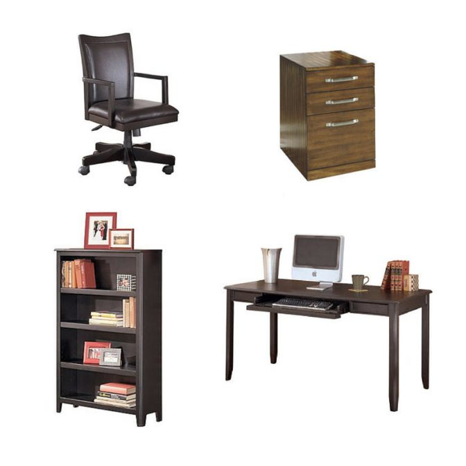
Ideally, you need a large table or office desk to maximize your working surface. Luckily, they come in a variety of shapes, so that you are not limited in the orientation. In addition, your officechair is also available in a variety of options such as leather, fabric and wood. That way, you don’t need to compromise comfort, durability and style! Next, some other helpful pieces that will maintain the room neat and organized includebookcases and filing cabinets. No more scattered papers and books!
pic3
Yes, color matters!
Color is often a direct reflection of our personality. In a home, studies have shown that certain colors produce a similar reaction in most individuals. However, depending on the tone, there can be a slight variation. Room colors are categorized in three basic ways: active, passive and neutral. That being said, for an office, it is probably not best to go too passive or too active. The optimal choice would be to select neutral wall colors (grey, white, brown) with colored home accents.
   RedVery intense; will pump adrenaline like no other. It will stir up excitement.
   YellowEvokes happiness, but can cause frustration in large amounts (whole room)
   BlueA soothing and calming color. Great for relaxation.
   GreenMost restful for the eye. Promotes warmth and comfort.
   PurpleRich, dramatic and sophisticated. Lighter tones promote restfulness.
   OrangeEnergetic and enthusiastic.
Now you have all the tools to plan ahead, you can ensure the success of your child, as well as your professional success.